Rover¹
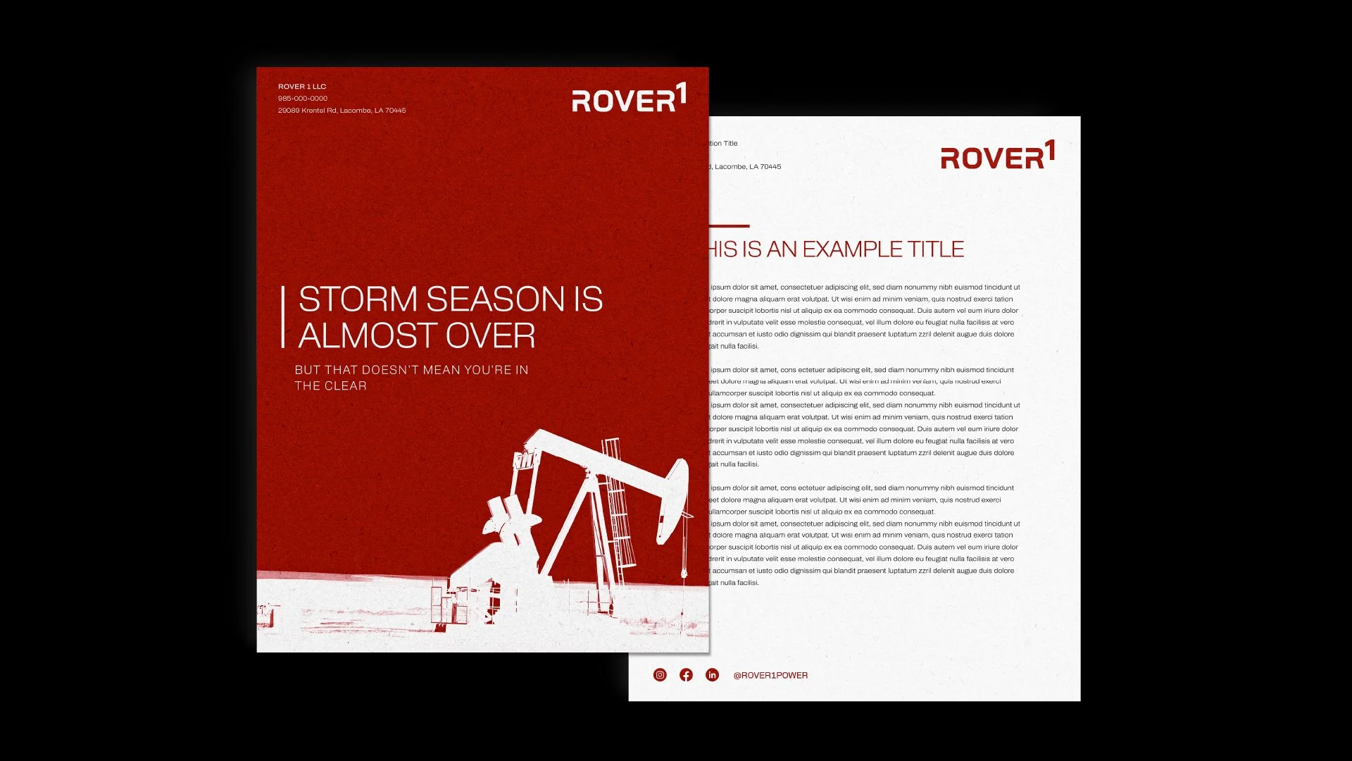
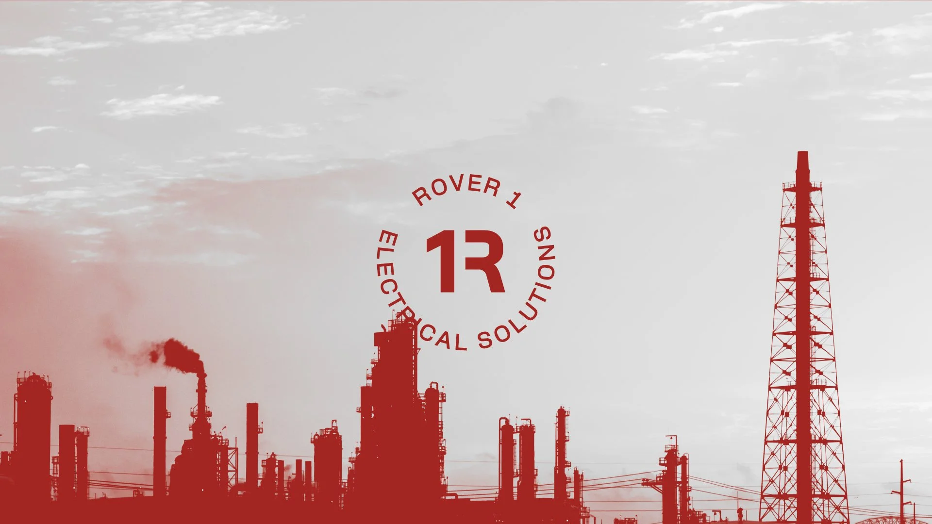
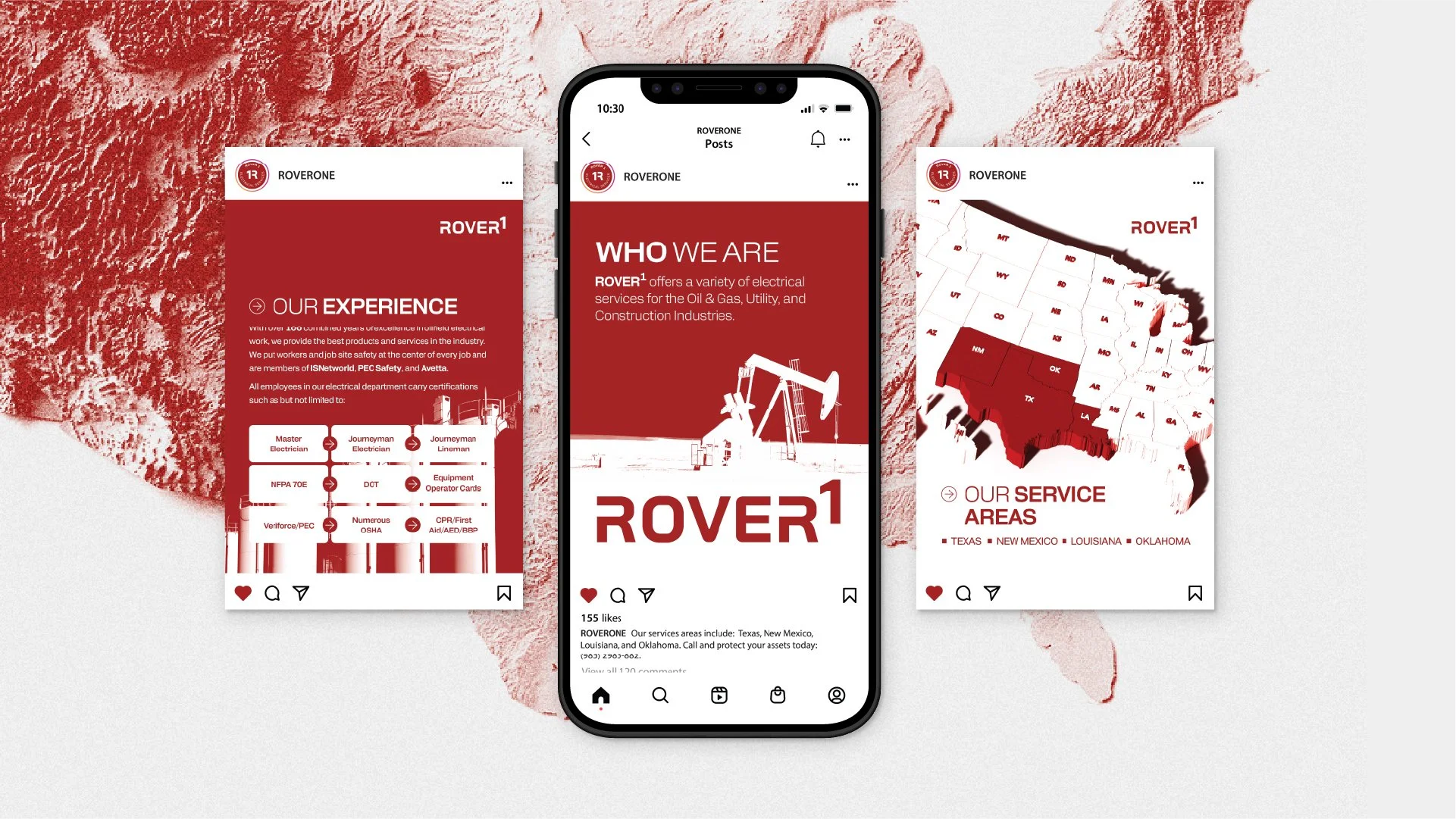
Rover¹ is a lightning protection and electrical services company operating across Texas, New Mexico, Oklahoma, and Louisiana. They wanted a tech-forward logo that reflected their innovative approach and high-performance services.
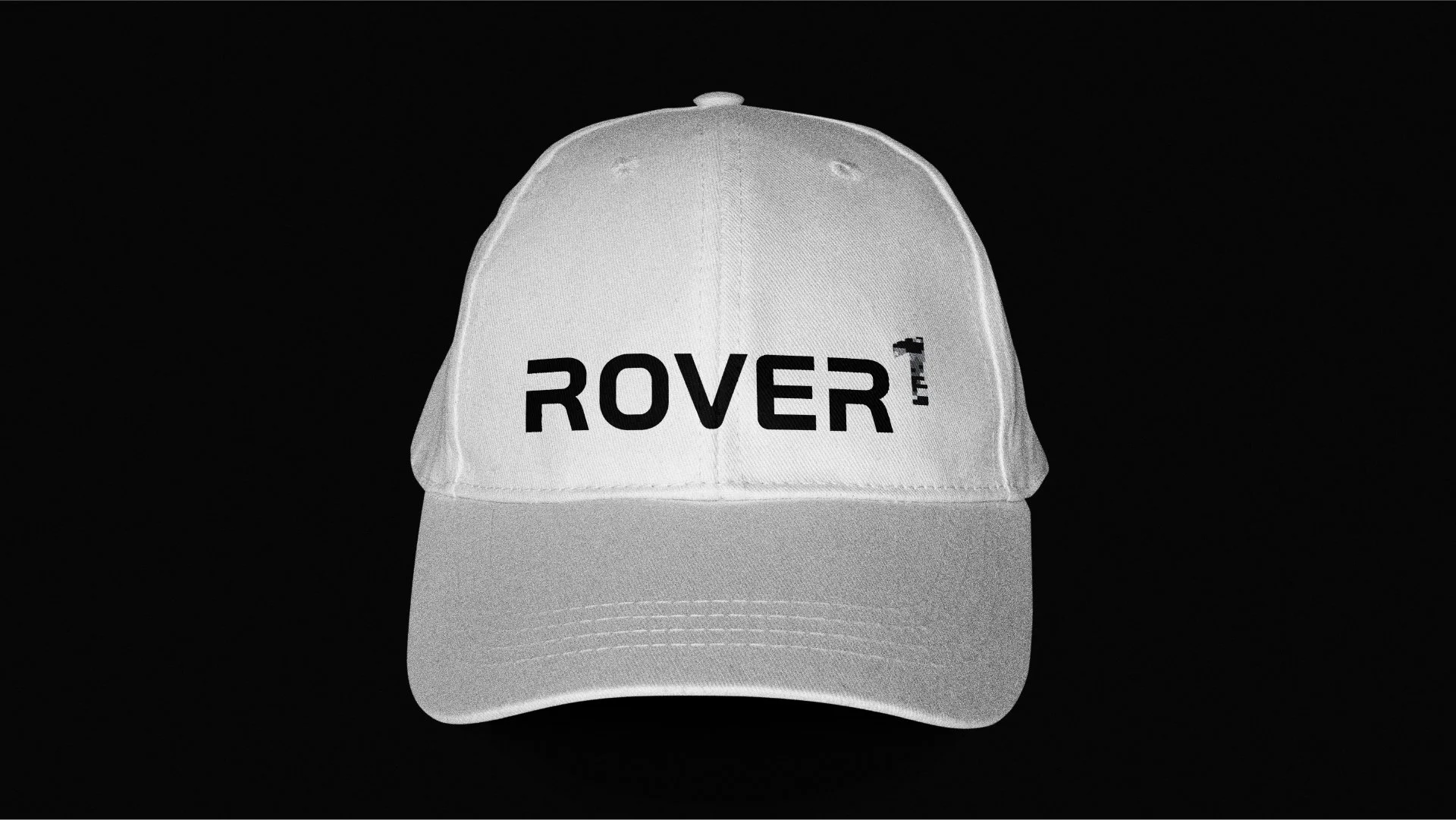
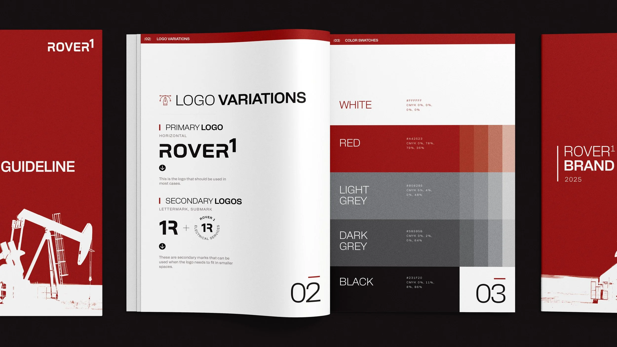
A key design challenge was the brand name itself. The use of the numeral "1" in "Rover1" (as opposed to spelling it out) presented issues with legibility and visual balance. To address this, the "1" was stylized as an exponent, creating visual distinction and making it instantly recognizable. This approach not only heightens the visual identity, but also ensures consistent branding across all applications because the exponent can be easily replicated in plain text format.
In addition, the exponent conveys an underlying message: “to the power of one”—reinforcing the company’s strength, individuality, and forward-thinking vision.
Credits
Rachel Kinchen: Brand Identity